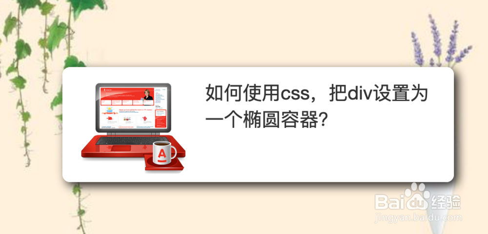
如何使用css,把div设置为一个椭圆容器,在做html页面开发时,我们一般都是使用div来做容器的,如果你需要一个椭圆形的容器,我们可以使用div来实现的,下面来看一下。......
html+css3图书3D动画
来源:互联网
2023-03-16 19:10:14 289
html css3图书3D动画
工具/原料
- adobe dreamweaver
方法/步骤
准备好需要用到的图标。


新建html文档。

书写hmtl代码。
div class="container group">
h1 class="main-title">css3图书3D动画/h1>
a href="#" class="book-container">
div class="book">
div class="book-cover"> img src="images/cover.jpg" alt="" /> /div>
div class="book-spine">
h1>Photography for Chinaz/h1>
/div>
/div>
/a> /div>

初始化css代码。
style>
html, body, div, span, object, iframe, h1, h2, h3, h4, h5, h6, p, blockquote, pre, abbr, address, cite, code, del, dfn, em, img, ins, kbd, q, samp, small, strong, sub, sup, var, b, i, dl, dt, dd, ol, ul, li, fieldset, form, label, legend, table, caption, tbody, tfoot, thead, tr, th, td, article, aside, dialog, figure, footer, header, hgroup, menu, nav, section, menu, time, mark, audio, video { margin: 0; padding: 0; border: 0; outline: 0; font-size: 100%; vertical-align: baseline; background: transparent; }
body { line-height: 1; margin: 0; }
article, aside, dialog, figure, footer, header, hgroup, nav, section { display: block; }
nav ul { list-style: none; }
blockquote, q { quotes: none; }
blockquote:before, blockquote:after, q:before, q:after { content: ''; content: none; }
a { margin: 0; padding: 0; border: 0; font-size: 100%; vertical-align: baseline; background: transparent; outline: 0; }
ins { background-color: #ff9; color: #000; text-decoration: none; }
mark { background-color: #ff9; color: #000; font-style: italic; font-weight: bold; }
del { text-decoration: line-through; }
abbr[title], dfn[title] { border-bottom: 1px dotted #000; cursor: help; }
table { border-collapse: collapse; border-spacing: 0; }
hr { display: block; height: 1px; border: 0; border-top: 1px solid #cccccc; margin: 1em 0; padding: 0; }
input, select { vertical-align: middle; }
/style>

书写css代码。
.group:after { content: "."; display: block; height: 0; clear: both; visibility: hidden; }
* html .group { height: 1%; }
*:first-child html .group { min-height: 1px; }
body { line-height: 1.9em; color: #fff; background: #0b3065 url(images/bg.jpg) center top fixed no-repeat; background-size: cover; font-family: arial, sans-serif; }
.container { max-width: 60em; margin: 0 auto; padding: 0 2em; }
.text.container { max-width: 38em; text-align: center; margin: 50px auto 100px; text-shadow: 0 1px 2px rgba(0, 0, 0, 0.75); }
a { color: #da9803; text-decoration: none; }
a:hover { text-decoration: underline; }
h1.main-title { font-family: 'Helvetica Neue', Helvetica, Arial, sans-serif; color: #fff; font-weight: normal; margin: 1.25em; text-align: center; font-size: 2.75em; letter-spacing: -1px; }
p { margin-bottom: 1em; font-size: 1.25em; }
hr { margin: 2em 0; }
.book-container { width: 375px; margin: 0 auto; display: block; -webkit-perspective: 1200px; -moz-perspective: 1200px; perspective: 1200px; }
.book { z-index: 5; box-shadow: 0 2px 4px rgba(0, 0, 0, 0.25); -webkit-transition: 0.75s; -moz-transition: 0.75s; transition: 0.75s; -webkit-transform-style: preserve-3d; -moz-transform-style: preserve-3d; transform-style: preserve-3d; -webkit-transform-origin: 125px 0; -moz-transform-origin: 125px 0; transform-origin: 125px 0; }
.book:after { content: ""; position: absolute; top: 0; bottom: 0; left: 3px; width: 7px; background: url(images/ridge.png) repeat-y; z-index: 20; -webkit-transform: translateZ(1px); /* Fix for flickering in Chrome */ }
.book:hover { -webkit-transform: translateX(-10px) translateZ(35px) translateX(35px) rotateY(45deg); -moz-transform: translateX(-10px) translateZ(35px) translateX(35px) rotateY(45deg); transform: translateX(-10px) translateZ(35px) translateX(35px) rotateY(45deg); }
.book-cover { position: relative; z-index: 10; }
.book-cover img { vertical-align: bottom; max-width: 100%; height: auto; }
.book-spine { position: absolute; color: #fff; position: absolute; bottom: 0; top: 0; width: 50px; z-index: 5; overflow: hidden; box-shadow: 0 2px 4px rgba(0, 0, 0, 0.25); background: url(images/spine.jpg) -64px 0 no-repeat; background-size: auto 100%; -webkit-transform: rotateY(-90deg) translateX(-49px); -moz-transform: rotateY(-90deg) translateX(-49px); transform: rotateY(-90deg) translateX(-49px); -webkit-transform-origin: 0 0; -moz-transform-origin: 0 0; transform-origin: 0 0; }
.book-spine h1 { display: block; width: 325px; text-align: left; color: #fff; position: absolute; top: 0; left: 39px; text-indent: 43px; text-transform: uppercase; font-family: "league_gothic_condensedRg", "Helvetica Neue", Helvetica, Arial, sans-serif; font-size: 2em; opacity: 0.75; font-weight: normal; -webkit-font-smoothing: antialiased; -webkit-transform: rotateZ(90deg); -moz-transform: rotateZ(90deg); transform: rotateZ(90deg); -webkit-transform-origin: 0 0; -moz-transform-origin: 0 0; transform-origin: 0 0; }
.book-spine:before { display: block; content: ""; width: 100%; height: 100%; background: rgba(0, 0, 0, 0.3); }

代码整体结构。

查看效果。

以上方法由办公区教程网编辑摘抄自百度经验可供大家参考!
标签: HTML
上一篇:如何让滚动条不占位置 下一篇:HTML的hgroup元素
相关文章
- 详细阅读
- 详细阅读
-
HTML5创作工具,MAKA 2.0史上最全操作指南详细阅读
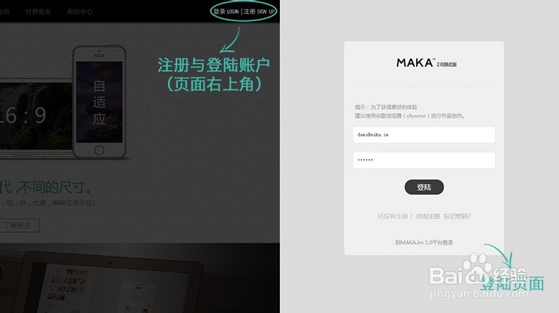
HTML5创作工具,MAKA 2.0史上最全操作指南,超过15000种模板组合。还怕你没有发挥的空间吗?MAKA(中文:码卡)作为中国最早推出移动端卡片式交互模式的创新者,随着HTML5技术的日渐成熟......
2023-03-16 435 HTML
![HTML网页制作:[17]CSS常用样式字体及颜色属性](https://exp-picture.cdn.bcebos.com/ba274f598540102a99638a11b142a07aa110c5d4.jpg)