如何使用css,把div设置为一个椭圆容器,在做html页面开发时,我们一般都是使用div来做容器的,如果你需要一个椭圆形的容器,我们可以使用div来实现的,下面来看一下。......
html+css3实现电脑和手机传输动画
来源:互联网
2023-03-16 19:11:04 131
html css3实现电脑和手机传输动画
工具/原料
- adobe dreamweaver
方法/步骤
新建html文档。

书写hmtl代码。
div class="container">
h3 class="head">连接服务器/h3>
div class="component PC">
div class="flare">/div>
/div>
div class="component signals">
div class="dot first">/div>
div class="dot second">/div>
div class="dot third">/div>
/div>
div class="component server">
div class="slot">/div>
div class="slot">/div>
div class="button">/div>
div class="button">/div>
/div>
/div>

初始化css代码。body { margin: 0; padding: 0; background: #CCC; }
.container { position: absolute; top: 50%; left: 50%; transform: translate(-50%, -50%); min-width: 500px; margin: 0px; }
.head { width: 100%; text-align: center; font-family: 'Lato', sans-serif; padding-bottom: 20px; font-weight: normal; color: #222; letter-spacing: 1px }
.component { float: left; margin: 10px; position: relative; }
.PC { height: 100px; width: 40%; border: 5px solid #333; border-radius: 5px; position: relative; }
.PC:before { content: ''; width: 5px; height: 20px; border: 5px solid #333; position: relative; left: 50%; transform: translate(-50%); top: 100px; display: block; background: #333; }
.PC:after { content: ''; width: 40px; height: 0px; border: 4px solid #333; position: relative; left: 50%; transform: translate(-50%); top: 95px; display: block; border-radius: 3px; }
.PC .flare { width: 50px; height: 1px; background: #AAA; position: absolute; left: 50%; top: 50%; transform: translate(-50%, -50%) rotate(-45deg); }
.PC .flare:after, .PC .flare:before { content: ''; width: 30px; height: 1px; background: inherit; position: absolute; top: -5px; left: 50%; transform: translate(-50%, -50%); }
.PC .flare:after { top: 6px; }
.signals { width: 30%; height: 100px; }
.signals .dot { width: 10px; height: 10px; background: #444; display: inline-block; border-radius: 50%; position: absolute; left: 30%; top: 50%; opacity: 0; transform: translate(-50%, -50%); animation: blink 0.3s ease-in infinite alternate; }
.signals .first { margin-left: 0px; }

书写css代码。
.signals .second { margin-left: 30px; animation-delay: 0.1s; }
.signals .third { margin-left: 60px; animation-delay: 0.2s; }
.server { width: 12%; height: 130px; border: 5px solid #333; border-radius: 5px; position: relative }
.server .slot { display: block; background: #444; width: 90%; height: 8%; margin: 10% 5%; position: relative; top: 55%; border-radius: 2px; }
.server .button { width: 6px; height: 6px; background: #444; display: inline-block; border-radius: 50%; position: absolute; right: 20%; bottom: 5%; }
.server .button:last-of-type { height: 8px; width: 8px; right: 5%; }
@-webkit-keyframes blink { from {
opacity: 0
}
to { opacity: 1 }
}
@media only screen and (max-width: 500px) {
.container { width: 100%; min-width: 100% }
.component { display: block; float: left; clear: both; left: 50%; transform: translateX(-50%); }
.signals { transform: translateX(-50%) rotate(90deg); }
.server { width: 17%; }
}

代码整体结构。

查看效果。

以上方法由办公区教程网编辑摘抄自百度经验可供大家参考!
标签: HTML
相关文章
- 详细阅读
- 详细阅读
-
HTML5创作工具,MAKA 2.0史上最全操作指南详细阅读
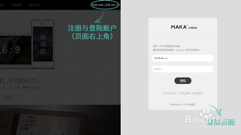
HTML5创作工具,MAKA 2.0史上最全操作指南,超过15000种模板组合。还怕你没有发挥的空间吗?MAKA(中文:码卡)作为中国最早推出移动端卡片式交互模式的创新者,随着HTML5技术的日渐成熟......
2023-03-16 434 HTML
![HTML网页制作:[17]CSS常用样式字体及颜色属性](https://exp-picture.cdn.bcebos.com/ba274f598540102a99638a11b142a07aa110c5d4.jpg)